AI Competency Centre · design round 2 · 7 November 2026

Canvas experience: design sampler

Five ways to organise the Canvas site and five visual styles, for Dominik and Ella to choose from. Structure and style are separate choices: pick one of each, or combine parts.

What changed in round 2

Dominik's review of round 1: the pages did not look good on a MacBook Air, wasted vertical space, needed more variety and lacked the real logos. Every candidate now has a single header row of about 64 px with the real University and Centre logos, and no hero band. On a 1440 x 820 laptop window each home shows 8 to 17 sessions on the first screen, against one before. Four new candidates add variety: UX-D Index, UX-E Canvas native, V4 Swiss grid and V5 Warm learning. Judges now score a laptop criterion, and the screenshots they see are taken at laptop size.

How to review

  1. Open each candidate. A Review button at the bottom right of every candidate lists all its screens and states, including the phone view and the slide reader with scripts turned off.
  2. Structure candidates (UX) are deliberately grey: judge the routes, not the look. Style candidates (V) share one layout: judge the look, not the routes.
  3. The slide reader is the screen that started this round. Every candidate restyles the same 16 slides from the BETT 2023 talk.
  4. Scores come from four independent model judges (two Claude Sonnet 5.5, two GPT-6.1 Sol) who did not build anything, using these journeys and constraints. They are a signal; your choice decides. Every score with its reason.
  5. Record your choice at the bottom and paste it into Teams or an email.

Structure: how the site is organised

Who finds what, in how many steps. Each serves the same nine journeys: revisit a session, read slides, choose and book, search, ask for help, share a session, give feedback, maintain the site, and cope with failures.

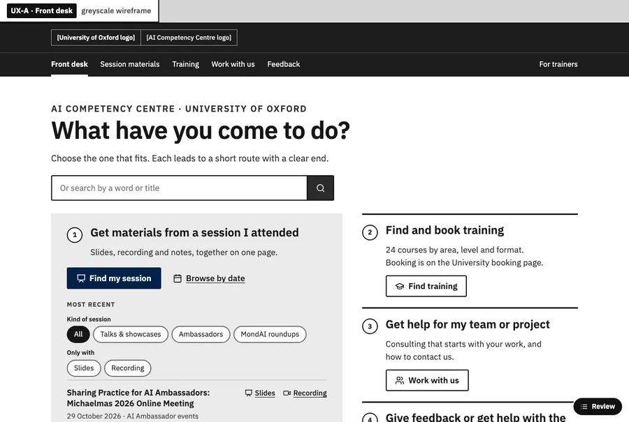
UX-A Front desk: home screen at laptop width

UX-A

Front desk

Task-first. The home asks what you came to do and offers four doors: materials from a session, find and book training, help for your team, give feedback.

7.4 / 10 judges' overall, range 7–8, 4 seats

Journeys served8.0
First visit8.2
Back to my slides8.0
Not busy7.2
Clear for maintainers8.5
Laptop first screen6.2
Canvas and phone7.0
What judges would keep and fix

Keep

  • The dominant returning-attendee route and explicit five-record maintenance explanation.
  • Plain task wording and reader links that explicitly connect slides, recording, notes, feedback and opening outside the frame.

Fix next

  • Flatten the attendee panel into a compact search-and-session list so actual sessions appear immediately below the introduction and remain visible before secondary doors on phones.
  • Replace the tall framed attendee panel and stacked phone chrome with a compact recent-session list and a short task-navigation row.
Open UX-A Slide reader Design notes

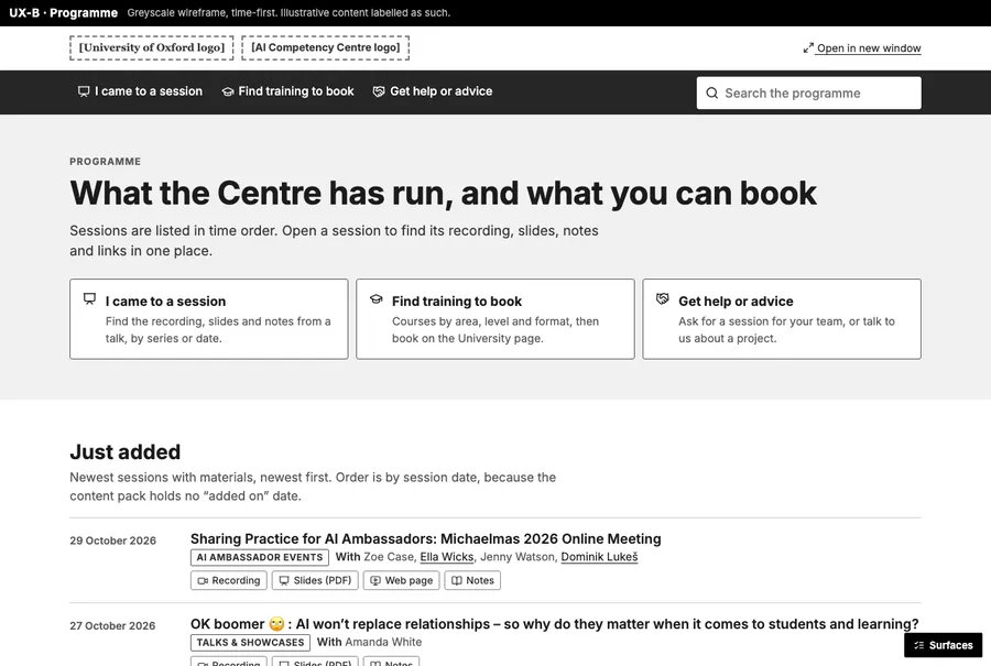
UX-B Programme: home screen at laptop width

UX-B

Programme

Time-first. Just added, coming up and bookable, and an archive by month and series. The session page is the single unit holding everything.

7.8 / 10 judges' overall, range 7–8.3, 4 seats

Journeys served8.0
First visit8.5
Back to my slides8.5
Not busy7.0
Clear for maintainers8.8
Laptop first screen7.5
Canvas and phone8.0
What judges would keep and fix

Keep

  • Three plain-language doors paired with chronological sessions and direct material actions.
  • Explicit Slides and Recording actions, a compact phone header, and a calendar that separates month-only entries from dated sessions.

Fix next

  • Compact session rows by moving presenter detail to the session page, retaining the title, date, series and direct material actions.
  • Compress home-row metadata by reducing repeated presenter and badge detail so long titles consume fewer lines in the Canvas frame.

Open UX-B Slide reader Design notes

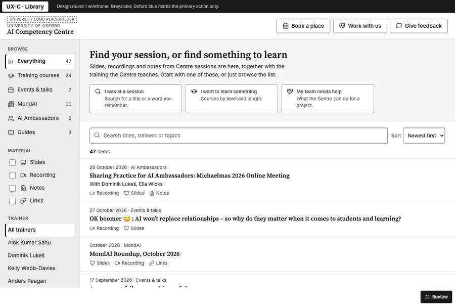
UX-C Library: home screen at laptop width

UX-C

Library

Browse-first. One library workspace: collections and filters on the left, a searchable list, and a preview of the selected item.

8.4 / 10 judges' overall, range 7.8–9, 4 seats

Journeys served8.2
First visit8.8
Back to my slides9.0
Not busy7.2
Clear for maintainers8.2
Laptop first screen8.5
Canvas and phone7.5
What judges would keep and fix

Keep

  • Session-level Overview, Slides, Recording, Notes and Links tabs keep related materials together.
  • Three clear audience doors followed immediately by recent sessions, with richer filters deferred until browsing or searching.

Fix next

  • Replace repeated material labels beside the Slides action with a compact treatment that leaves laptop session titles enough room to identify the event.
  • Rework the reader rail so it contains useful slide contents or releases its width to the deck instead of reserving a mostly empty column.

Open UX-C Slide reader Design notes

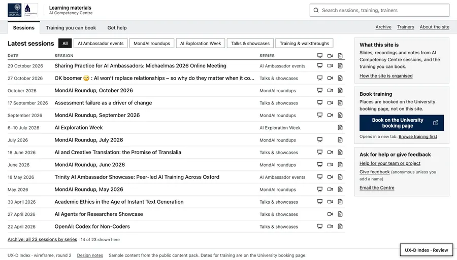
UX-D Index: home screen at laptop width

UX-D

Index

One-screen index. No hero: search sits in the header, and the home is a compact table of sessions with tabs for sessions, training and help, so a laptop screen shows a dozen items at once.

7.5 / 10 judges' overall, range 7–8, 4 seats New in round 2

Journeys served7.0
First visit7.0
Back to my slides8.5
Not busy6.0
Clear for maintainers8.5
Laptop first screen8.5
Canvas and phone7.5
What judges would keep and fix

Keep

  • Compact session rows and a reader that shows multiple bounded slides within the laptop viewport.
  • Compact session rows with direct material actions, plus a session page that exposes all seven materials inside the laptop Canvas frame.

Fix next

  • Restore the omitted calendar capability using the same event records, keeping the compact index as the primary laptop entry.
  • Restore the retained calendar and optional pathway routes within the existing compact navigation.

Open UX-D Slide reader Design notes

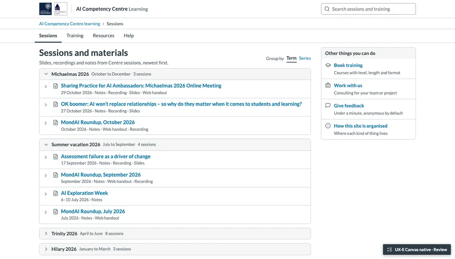
UX-E Canvas native: home screen at laptop width

UX-E

Canvas native

Feels like part of the Canvas course. Minimal own chrome, Canvas-style breadcrumbs, module-like lists and plain tabs, relying on Canvas's own frame instead of a second website header.

6.8 / 10 judges' overall, range 6–7.1, 4 seats New in round 2

Journeys served6.5
First visit7.5
Back to my slides7.0
Not busy8.0
Clear for maintainers8.0
Laptop first screen6.8
Canvas and phone7.5
What judges would keep and fix

Keep

  • Expandable modules provide a distinct, understandable way to group sessions and expose their materials.
  • Collapsible session groups and a concise materials outline provide meaningful structural variety while keeping the record model clear.

Fix next

  • Combine the header, breadcrumb and tab treatment to bring the first session materially higher without shrinking the content.
  • Preserve the typed query in navigation history before opening a live suggestion so Back returns to the remembered-word search.

Open UX-E Slide reader Design notes

Visual style

The same home, session page, slide reader and components, styled five ways. All keep Oxford blue as the anchor and must work inside the Canvas frame, on a phone, and without scripts.

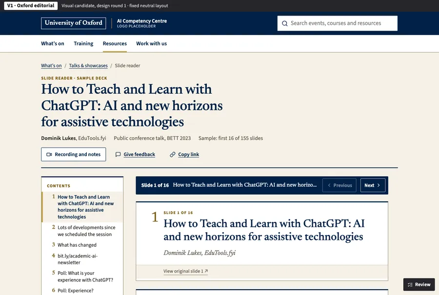
V1 Oxford editorial: reader screen at laptop width

V1

Oxford editorial

A quiet academic publication: serif headings, warm paper, Oxford blue and a little gold. Slides read like numbered figures in a journal.

8.2 / 10 judges' overall, range 7.5–8.5, 4 seats

Slide reader8.8
Hierarchy7.8
Oxford, light, calm8.8
Consistent system8.2
Designed states8.0
Laptop scale7.8
Access and phone7.5
What judges would keep and fix

Keep

  • Serif publication typography, restrained gold numbering and small, high-contrast figures that work without scripts.
  • The serif publication typography and high-contrast figure treatment give converted slides a credible reading edition.

Fix next

  • Consolidate the reader's repeated title, slide-position and navigation strips into a quieter compact toolbar.
  • Consolidate the repeated slide framing and navigation bands to retain the editorial typography with less visual and vertical overhead.

Open V1 Slide reader Design notes

V2 Centre signal: reader screen at laptop width

V2

Centre signal

The approved pink and navy event-library identity, made calmer. Pink becomes the accent; slides sit on a stage as slide-shaped panels.

7.2 / 10 judges' overall, range 7–7.5, 4 seats

Slide reader6.8
Hierarchy7.5
Oxford, light, calm8.0
Consistent system7.5
Designed states7.5
Laptop scale6.8
Access and phone7.5
What judges would keep and fix

Keep

  • Compact event rows with consistently aligned material actions and restrained Centre-pink selection markers.
  • The compact navy identity bar and selective pink marker make the current material easy to identify.

Fix next

  • Replace fixed desktop slide aspect ratios with content-sized sections so short slides stop occupying large empty panels.
  • Replace the reader's desktop 16:9 section proportions with content-driven heights so short slides stop creating large empty panels.

Open V2 Slide reader Design notes

V3 Calm studio: reader screen at laptop width

V3

Calm studio

A light, contemporary product feel: white panels on a cool background, a serif for display, and a colour code for material kinds.

7.6 / 10 judges' overall, range 7–8, 4 seats

Slide reader7.2
Hierarchy8.2
Oxford, light, calm7.2
Consistent system8.2
Designed states8.5
Laptop scale7.0
Access and phone7.8
What judges would keep and fix

Keep

  • Compact training comparisons and recognisable material tags that combine colour, icons and text.
  • The restrained material-kind colours, thumbnail contents and well-composed feedback and unavailable panels.

Fix next

  • Remove the enhanced reader's fixed minimum slide height and use the content-sized proportions already demonstrated by its scripts-off reader.
  • Remove the enhanced reader's fixed minimum slide height so sparse slides use content-sized publication sections on laptops.

Open V3 Slide reader Design notes

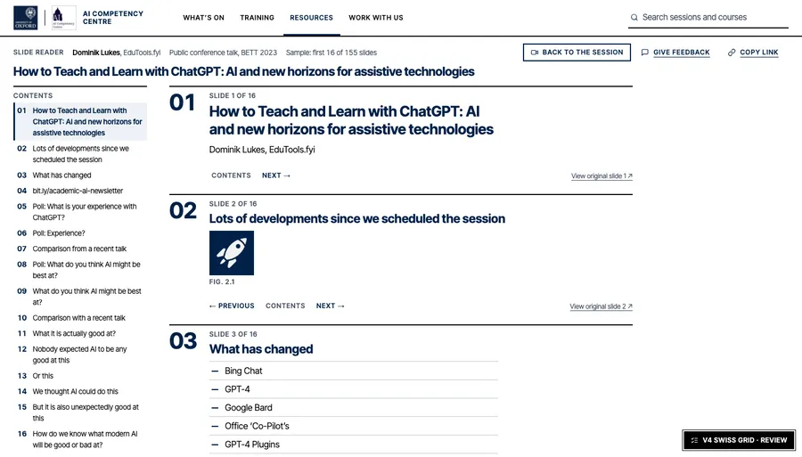
V4 Swiss grid: reader screen at laptop width

V4

Swiss grid

Strict grid and dense information design: one grotesque sans, black and Oxford blue, small capitals for labels, hairline-free blocks separated by solid rules and white space; reads like a well-set programme listing.

8.4 / 10 judges' overall, range 8.2–8.5, 4 seats New in round 2

Slide reader8.5
Hierarchy8.2
Oxford, light, calm7.5
Consistent system9.0
Designed states7.5
Laptop scale9.0
Access and phone7.5
What judges would keep and fix

Keep

  • Content-sized numbered reader sections and the efficient desktop event table.
  • The aligned laptop event table and content-sized, numbered reader sections make unusually good use of the available height.

Fix next

  • Increase the smallest utility text and reader-link targets while retaining the compact grid.
  • Increase and simplify secondary labels and navigation text, retaining the compact layout while eliminating cramped capitals and broken phone metadata labels.

Open V4 Slide reader Design notes

V5 Warm learning: reader screen at laptop width

V5

Warm learning

Friendly and approachable: a humanist sans, soft tinted panels in Oxford-adjacent tones (sage, sand, sky), rounded but restrained shapes, Lucide icons in tinted circles for material kinds.

7.1 / 10 judges' overall, range 6.8–7.5, 4 seats New in round 2

Slide reader7.0
Hierarchy7.5
Oxford, light, calm6.8
Consistent system7.8
Designed states7.8
Laptop scale6.8
Access and phone6.8
What judges would keep and fix

Keep

  • Clear grouping of sessions, training and team help, with approachable labels and generous controls.
  • The clearly labelled sky, sage and sand groups distinguish sessions, training and team help without large headings.

Fix next

  • Simplify the nested tinted containers and their padding to recover space and give the main content stronger visual priority.
  • Flatten the nested panel structure so colour groups content without adding a separate padded card around every row and control area.

Open V5 Slide reader Design notes

Questions the candidates raise

These came up in the builders' notes and the judges' reports. They hold whichever candidates you pick.

  1. Courses and events: one list or two? UX-C mixes them in one library. UX-A and UX-B keep "sessions we ran" and "training you can book" apart.
  2. Feedback: which service? Every candidate shows only a slot. The choice is an Oxford Microsoft Form or an approved conversational assistant. Each candidate's design notes say which it mocked and why.
  3. Typefaces: V1 and V3 pair a serif for headings with a sans for the interface, and V2 keeps the current Barlow. Should the University typeface guidance decide this? Whichever we choose would be hosted with the site rather than loaded from Google.
  4. Centre pink: V2 keeps it as a small accent, and V1 and V3 drop it. Should the Centre's pink stay visible?
  5. Dates: should the archive group sessions by Oxford term or by calendar month? The content has no term dates yet.
  6. Logo files: the only copies in the repositories are 100 px tall, so the logos are shown at about 44 px to stay sharp. Vector (SVG) versions from the Centre's brand files would allow a larger size.
  7. Presenters: event records have no presenter field. UX-B and UX-C show "With …" names, which they picked out of event summaries and material titles. Should event records get a proper presenter field?

Decided already, not a question: each of the 62 slide readers becomes its own page in Canvas, with a contents list, slide numbers and previous/next generated from the existing markup. Every candidate's reader works with scripts turned off.

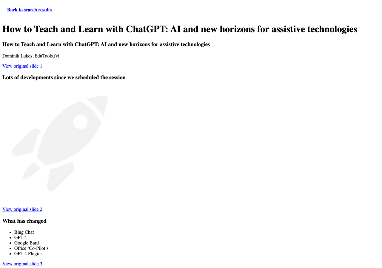
Today, for comparison

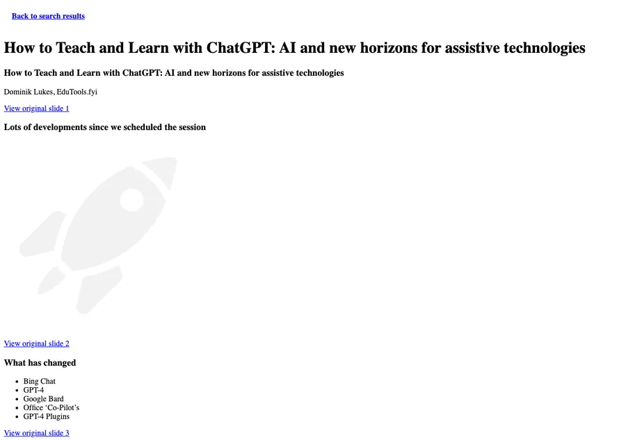
The current unstyled slide reader in the sandpit

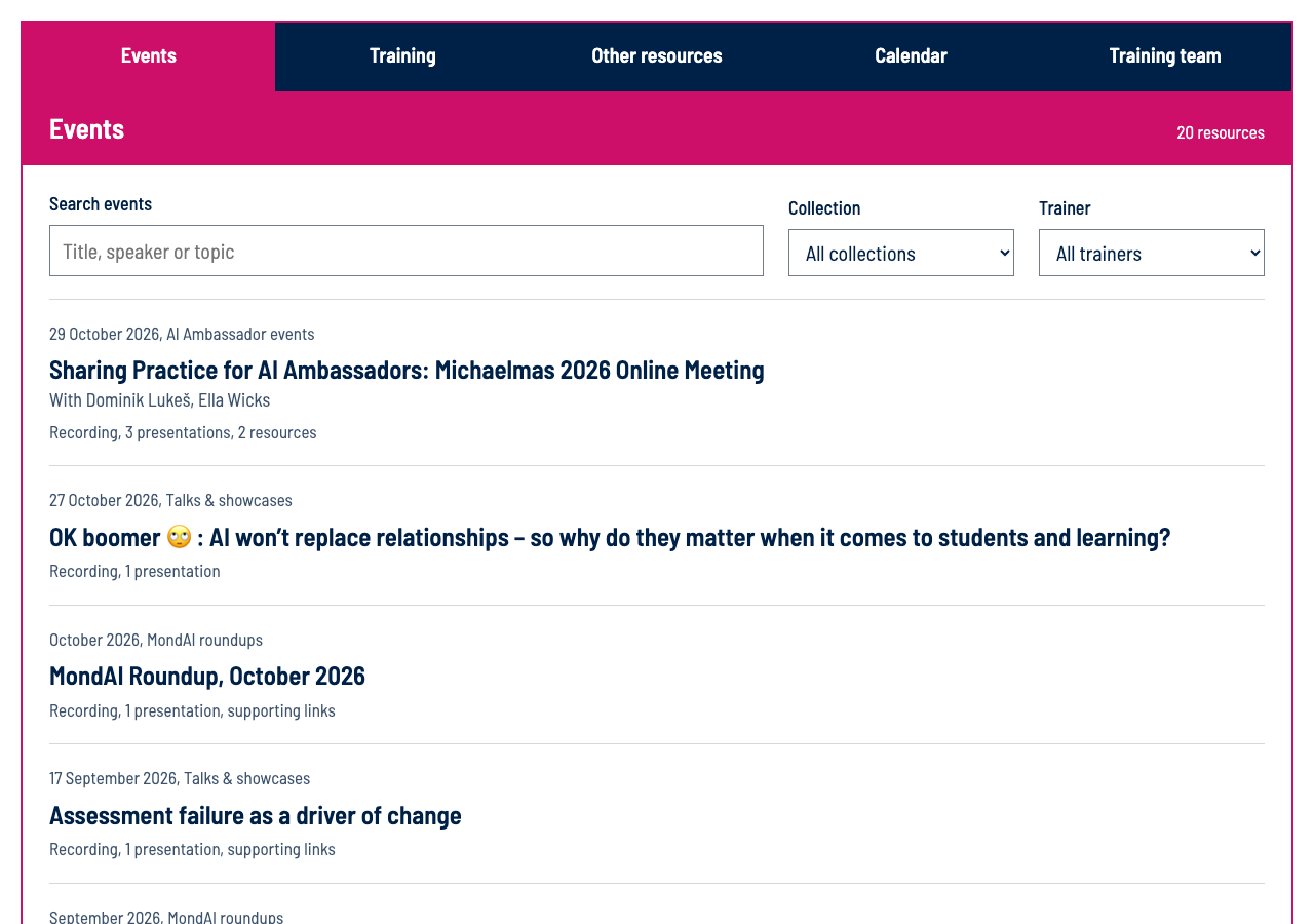
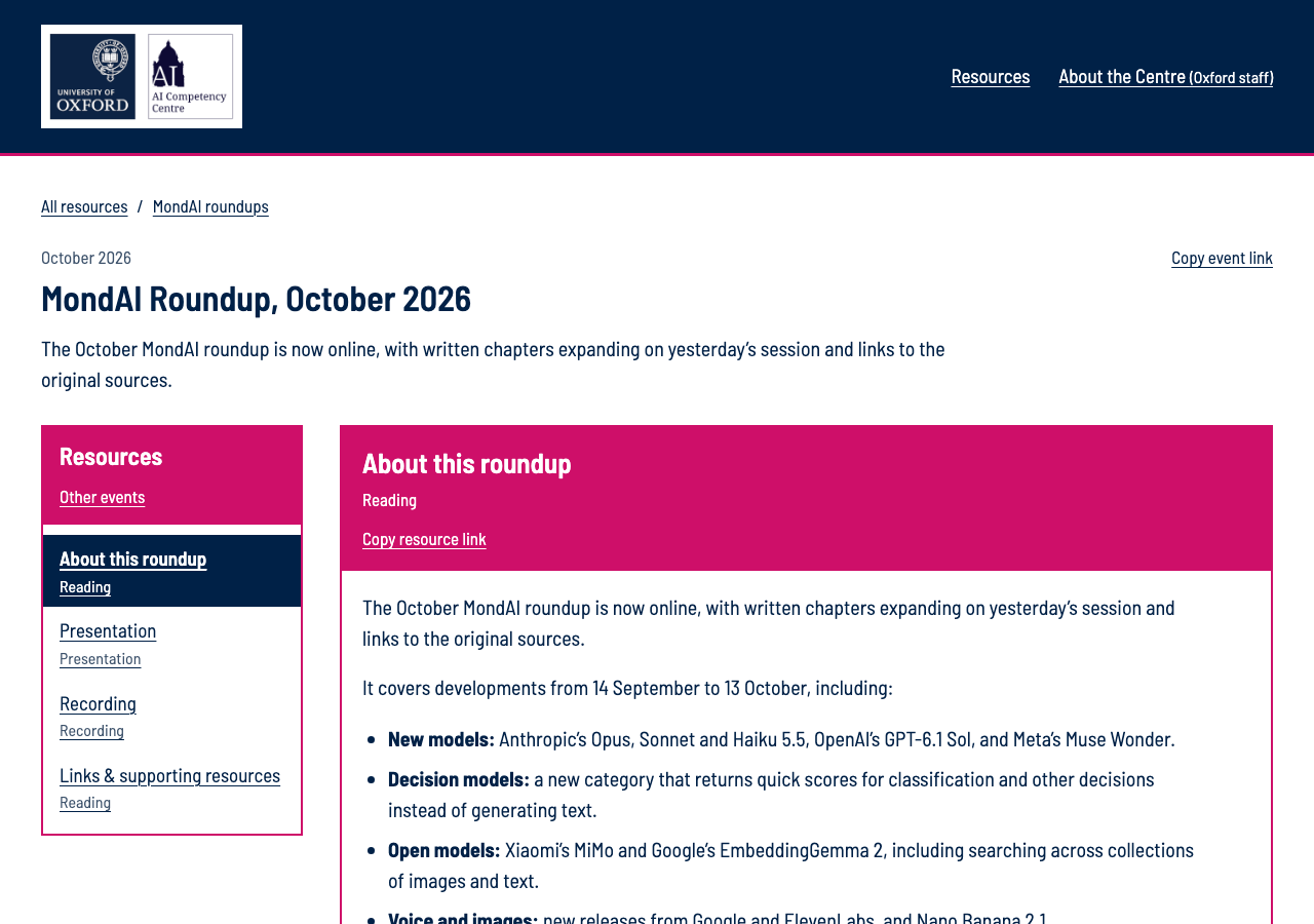
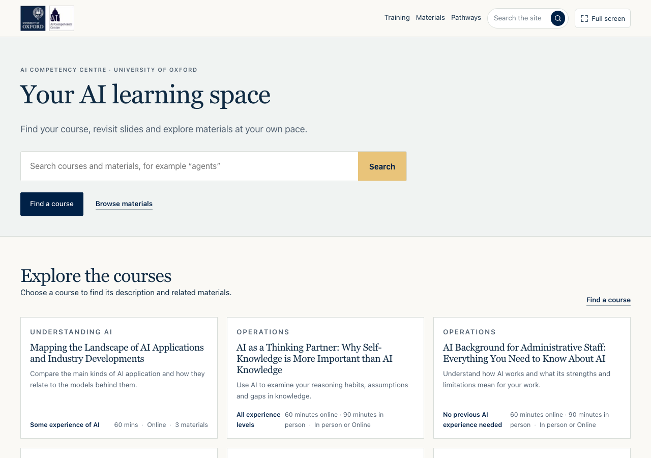
The current sites were scored on the same rubric: 4.4 for structure and 3.4 for style. Two homes grew separately (the course-first sandpit and the pink and navy event library), and the 62 converted slide readers have no styling.

Event library home · Event page · Sandpit home · Sandpit slide reader

Your choice

Nothing is sent anywhere. This builds a short text for you to copy.

Structure
Style